Alphonse Mucha stands as one of the defining figures of the late nineteenth-century decorative arts, his work synonymous with the flowing elegance and ornamental richness of the Art Nouveau style.
Emerging in Paris during the 1890s, Mucha developed a highly distinctive visual language that fused fine art, graphic design, and commercial illustration into a unified aesthetic. His compositions are immediately recognisable for their sinuous lines, harmonious palettes, and intricate detailing, often centred on idealised female figures framed by elaborate halos, floral motifs, and arabesque patterns.
Mucha’s breakthrough came with his poster for the play Gismonda, starring the celebrated actress Sarah Bernhardt. The poster’s elongated format, muted tones, and refined decorative elements diverged sharply from the more conventional advertising graphics of the time. It was an overnight success, transforming Mucha into a sought-after artist and establishing a new paradigm for poster design. His subsequent works for Bernhardt further refined this approach, balancing theatrical drama with ornamental sophistication.
Central to Mucha’s artistic philosophy was the belief that art should be accessible and integrated into everyday life. This principle is evident in his prolific output of commercial work, including advertisements, calendars, book illustrations, and decorative panels. Rather than viewing these as lesser forms, Mucha approached them with the same care and compositional rigour as his fine art. His posters for products such as cigarettes, biscuits, and perfumes elevated commercial imagery into objects of aesthetic contemplation, blurring the boundary between art and advertising.
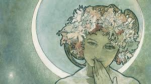
A defining characteristic of Mucha’s style is his treatment of the human figure, particularly the female form. His women are not merely portraits but symbolic embodiments of beauty, nature, and virtue. They are often depicted with flowing hair that merges seamlessly with surrounding decorative elements, creating a sense of unity between figure and environment. This integration reflects broader Art Nouveau ideals, where organic forms and natural motifs are stylised into rhythmic, almost musical compositions.
Colour also plays a critical role in Mucha’s work. He favoured soft, harmonious tones, often employing pastel shades combined with gold or earthy accents. This restrained palette contributes to the ethereal quality of his images, allowing line and form to take precedence over dramatic contrasts. His use of flat areas of colour, influenced in part by Japanese woodblock prints, enhances the graphic clarity of his designs while maintaining their decorative richness.
In addition to his commercial success, Mucha pursued more ambitious, nationalistic projects later in his career. His monumental cycle, The Slav Epic, represents a departure from his earlier decorative style, focusing instead on historical and cultural themes related to Slavic identity. While less commercially celebrated, this body of work underscores his broader artistic ambitions and his commitment to cultural expression.
Mucha’s influence extends far beyond his own era. His distinctive style has been repeatedly revived and reinterpreted, particularly during the psychedelic art movements of the 1960s and in contemporary graphic design. The enduring appeal of his work lies in its synthesis of beauty, craftsmanship, and accessibility. By elevating everyday visual culture through refined design and symbolic imagery, Mucha not only defined the visual language of Art Nouveau but also reshaped the role of the artist in modern society.
Leave a Reply