This is a guide to best practice when posting articles for reader accessibility, search engine optimisation (SEO) and all-round professional magazine look
Some of these practices are must-dos, others are recommendations. I’ll explain the whys and wherefores as we go.
Typography
The drop cap and first para styling are applied automatically. The first para needs to be long enough to wrap around the drop cap. The drop cap should be a letter, so don’t start with a number. Opening with a quote does not defeat the drop cap styling, but it does look a little messy (to my designer eye) so I’d advise avoiding starting an article with quote marks.
In the body copy of the articles, avoid italics, bold and capitals. For all readers – neurodiverse or note – sentence-case type in Roman fonts is the easiest on the eye online.
Keep paragraphs short to avoid long runs of body text. Remember, most visitors to the site will be on mobile phones, and it is easy to fill the screen of these devices with slabs of plain text. Use crossheads and pullquotes to break up body copy.

Pullquotes
Like crossheads, pullquotes are another way of breaking up long bodies of text. They also act as eye-catching tempts for skim-scrollers and as useful landmarks for readers looking to find particular parts of long articles.
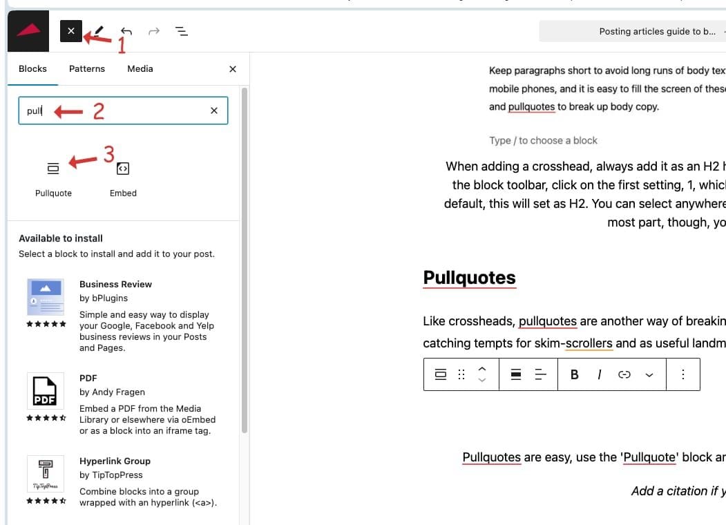
Pullquotes are easy, use the ‘Pullquote’ block and put your text in where it says ‘add quote’
Add a citation if you have one
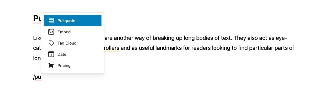
Add the pullquote block from the block library, or use the shortcut of typing: /pullquote in your post edit. Add the text of the quote, and a citation if you have one. Please don’t put speech marks around the quote. We all know what the graphic design of a pullquote means, putting speech marks around it is a tautology.
Boxed-out stories
Another trusted design feature we can co-opt from printed magazines is the ‘boxout’ story. Boxout stories make for visually interesting design, as well as the function of drawing attention or demarking a particular part of the story.
Creating a boxout
Add the content you wish to place in the boxout, You can place crossheads, images and even pullquotes in a boxout if you wish.
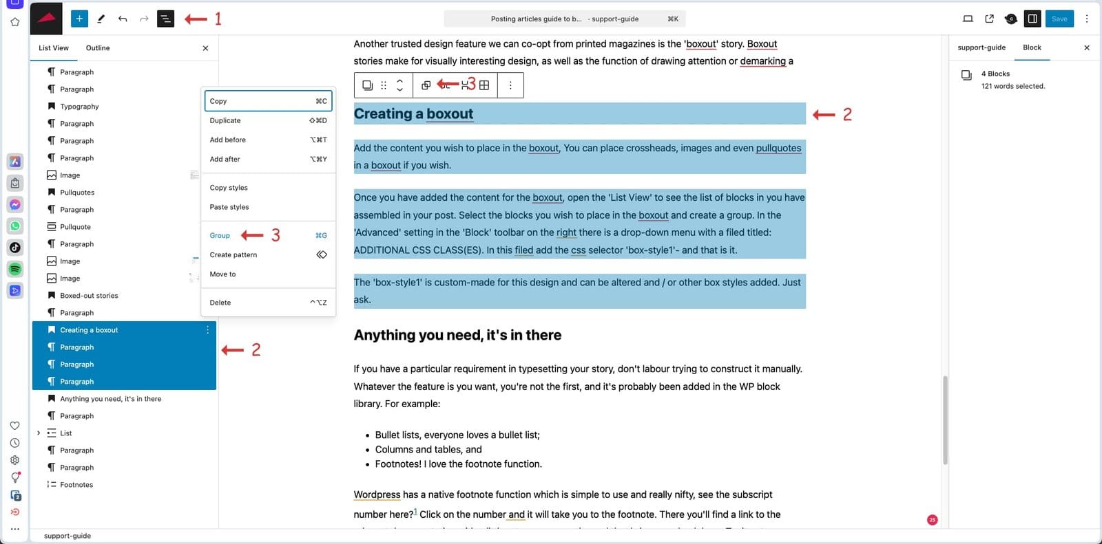
Once you have added the content for the boxout, open the ‘List View’ to see the list of blocks in you have assembled in your post. Select the blocks you wish to place in the boxout and create a group. In the ‘Advanced’ setting in the ‘Block’ toolbar on the right there is a drop-down menu with a filed titled: ADDITIONAL CSS CLASS(ES). In this filed add the css selector ‘box-style1’- and that is it.
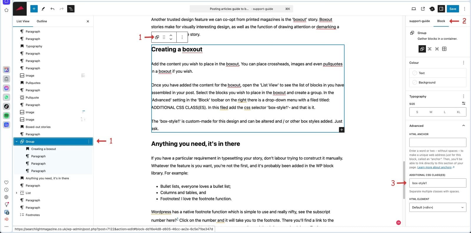
The ‘box-style1’ is custom-made for this design and can be altered and / or other box styles added. Just ask.
Once you have created a boxout story, you can edit, add to or delete from any of the content.
Anything you need, it’s in there
If you have a particular requirement in typesetting your story, don’t labour trying to construct it manually. Whatever the feature is you want, you’re not the first, and it’s probably been added in the WP block library. For example:
- Bullet lists, everyone loves a bullet list;
- Columns and tables, and
- Footnotes! I love the footnote function.
WordPress has a native footnote function which is simple to use and really nifty, see the subscript number here?1 Click on the number and it will take you to the footnote. There you’ll find a link to the relevant documentation with a little return arrow on the end that brings you back here. Try it out.
I won’t run through all these extra formatting tools, just be aware that there is now so much useful stuff out there that if you have a particular request, ask me or Google.
Dos and don’ts
I’d recommend writing your articles outside of WordPress, as I find it is not the best tool for writing. WordPress is designed for posting articles rather than creating them. My preferred text editor is Google Docs. The finished article can then be copied and pasted into WP for setting and fettling.
If you use Microsoft Word, work in a plain text doc. Word thinks it is cleverer than you and adds junk code in its docs that can make a mess in WP.
Don’t put any formatting in your text doc other than carriage returns and italics, raw text is best.
And finally…
The Searchlight signature end tag you see at the close of this article is added automatically after the last character you type, so do not finish your post with a flurry of blank spaces and carriage returns. Stop typing with your terminal punctuation and then my whizzo coding places the graphic right here.